

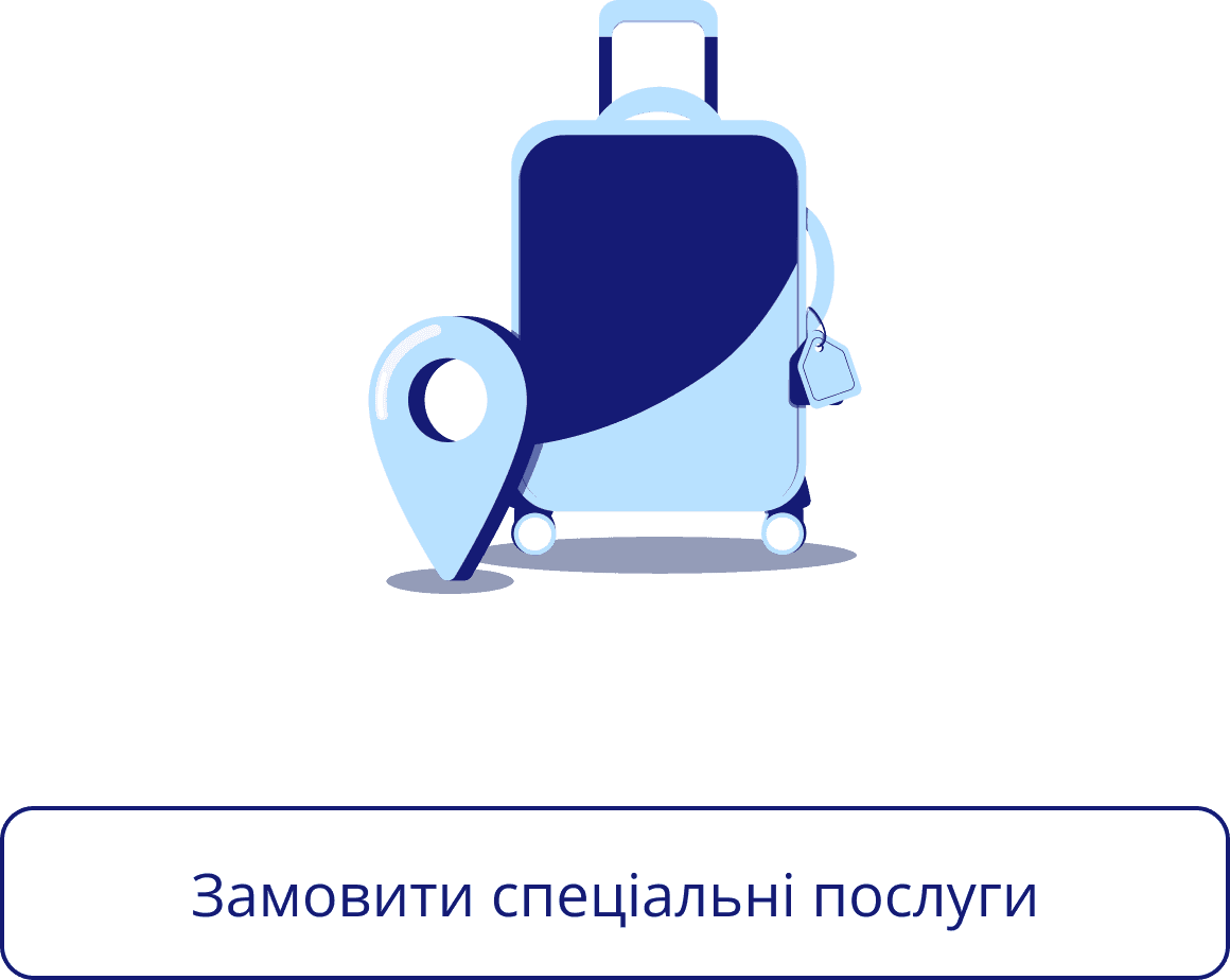
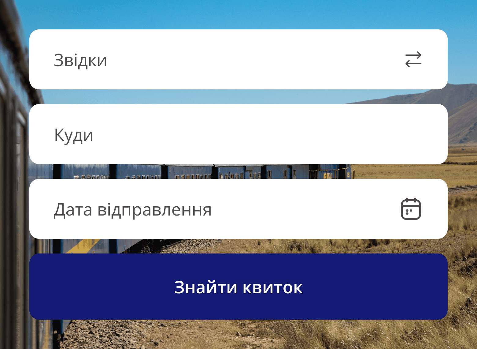
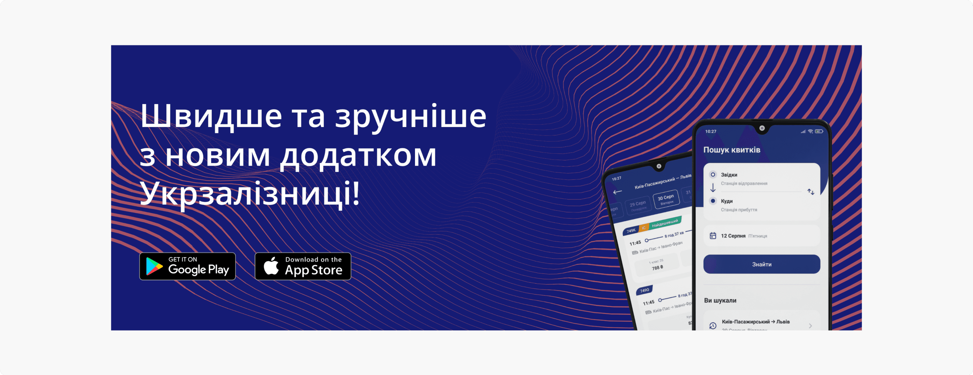
I redesigned the Ukrzaliznytsia website and admin panel to enhance user experience and streamline operations. The website simplifies ticket searches and purchases, while offering personalized options like group bookings, special wagons, and lost-and-found services. Real-time timetables, news, and service catalogs are seamlessly integrated for a smooth user journey.
The admin panel provides efficient tools for managing orders, client data, services, and site content. With distinct roles for administrators, content managers, and support staff, the system ensures streamlined operations and improved service delivery.
landing page
admin panel
Case study
Branding
User Research Survey
User flow
competitor analysis
ux design
UI DESIGN
aDAPTATION
oct 23
/ feb 24
Branding
The redesign's branding reflects modernity, clarity, and accessibility.
The design emphasizes readability, with a clear color palette and accessible typography that ensures inclusivity for users with varying visual abilities. Every detail, from button sizes to color contrast, was crafted to enhance user interaction while maintaining the company’s recognizable identity.

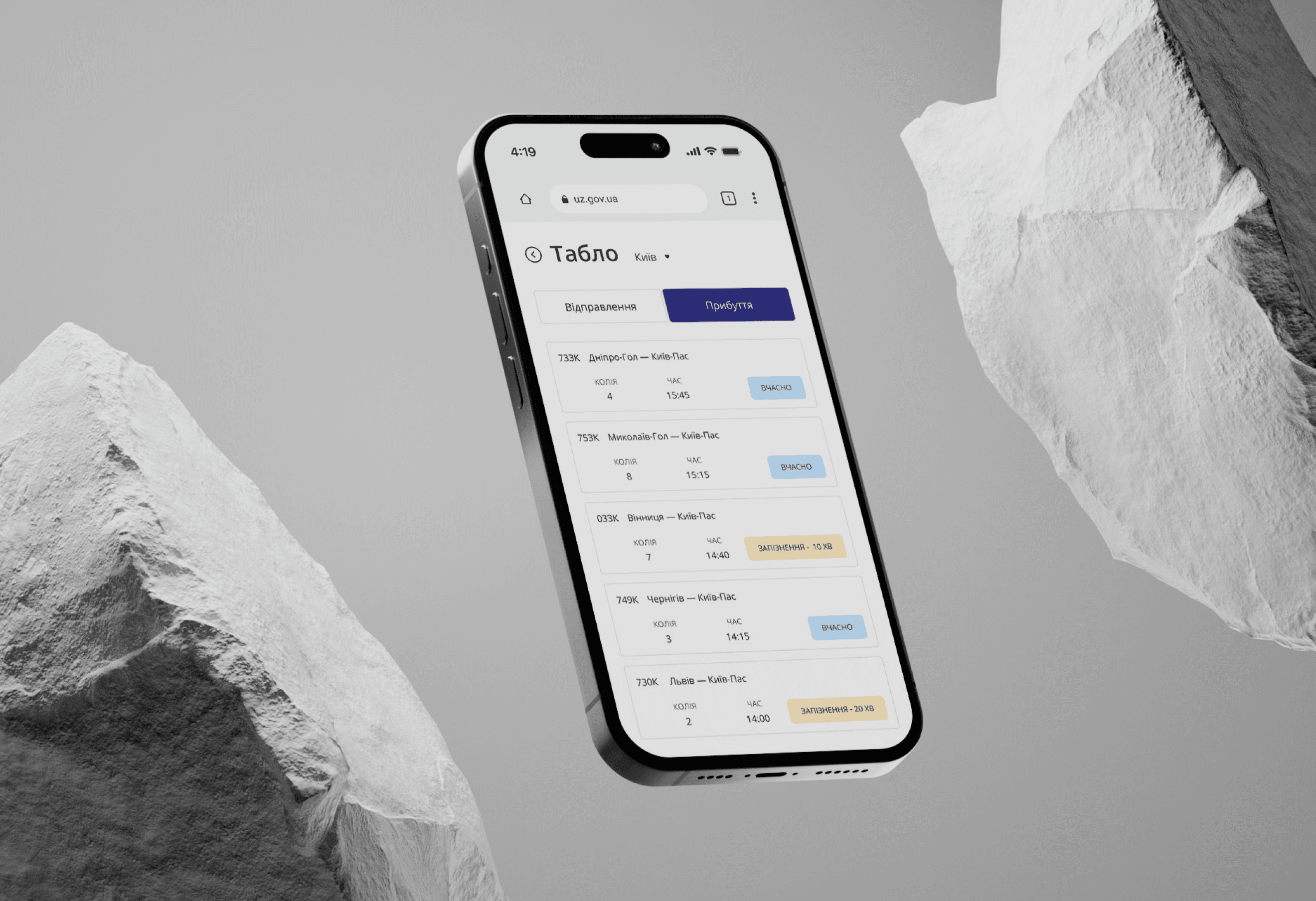
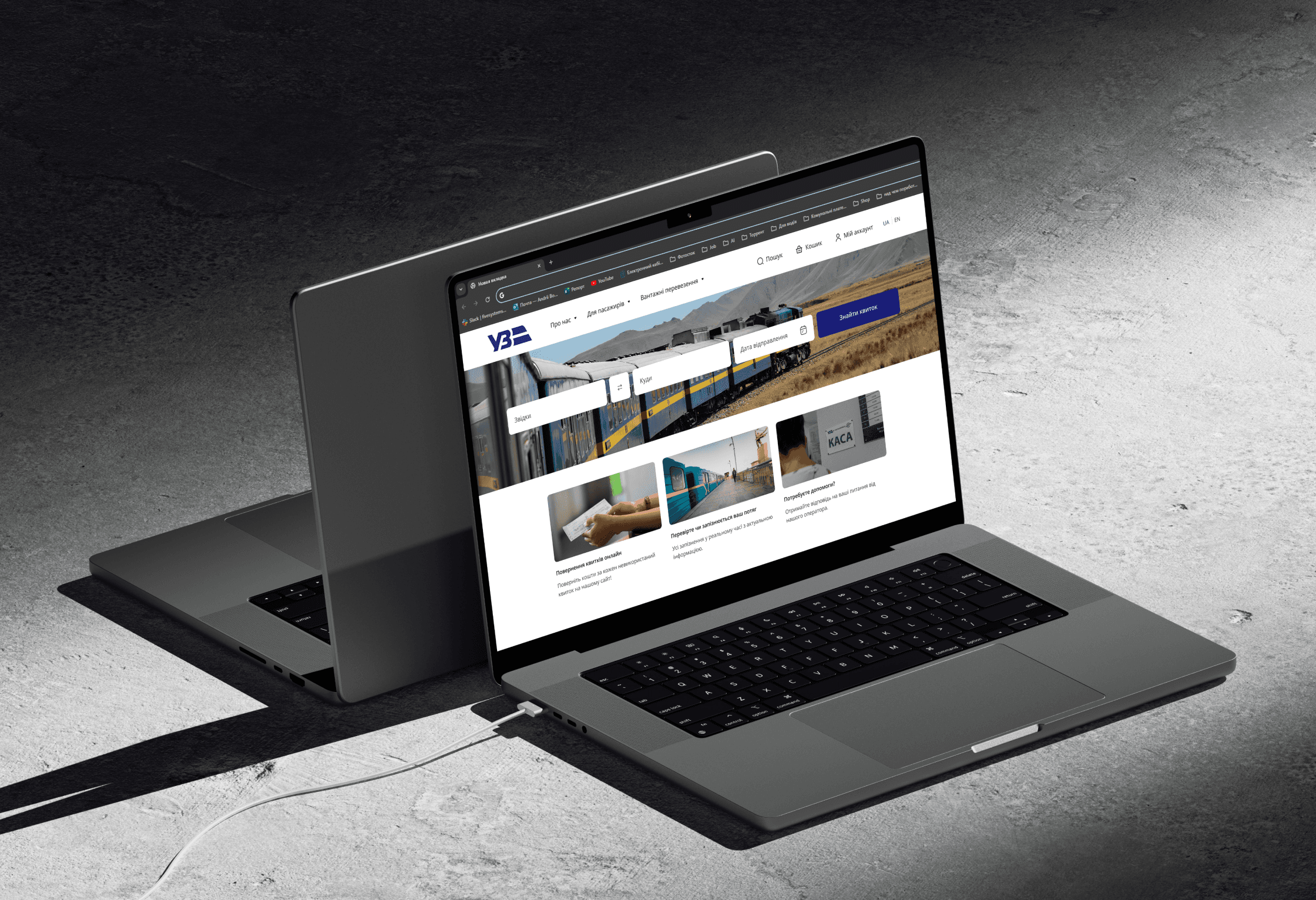
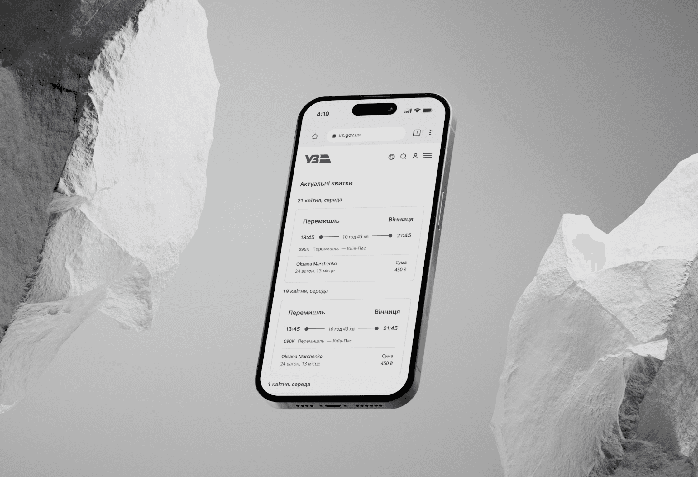
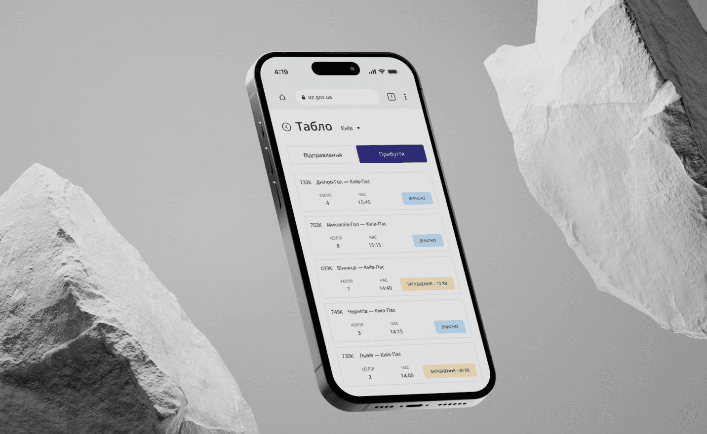
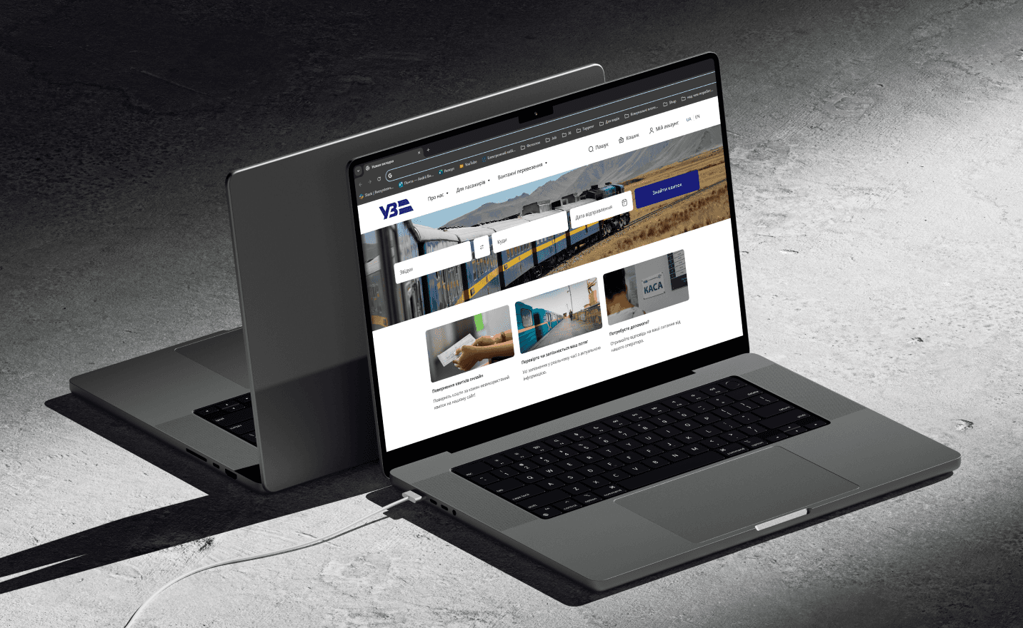
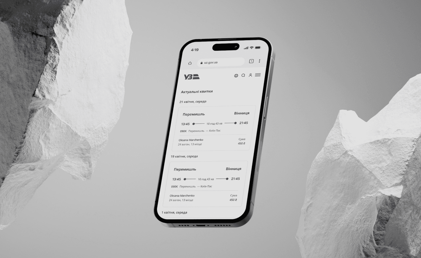
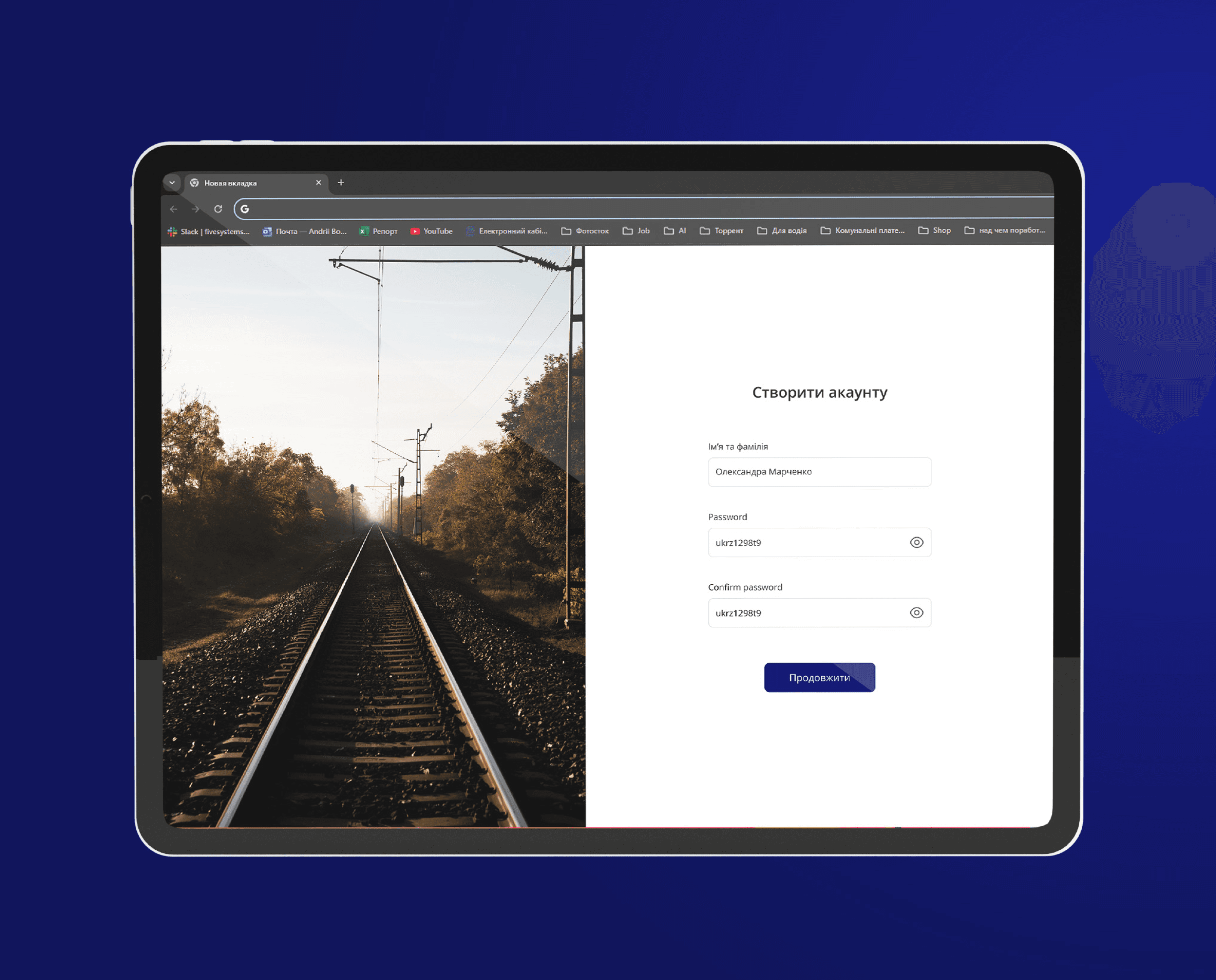
Website
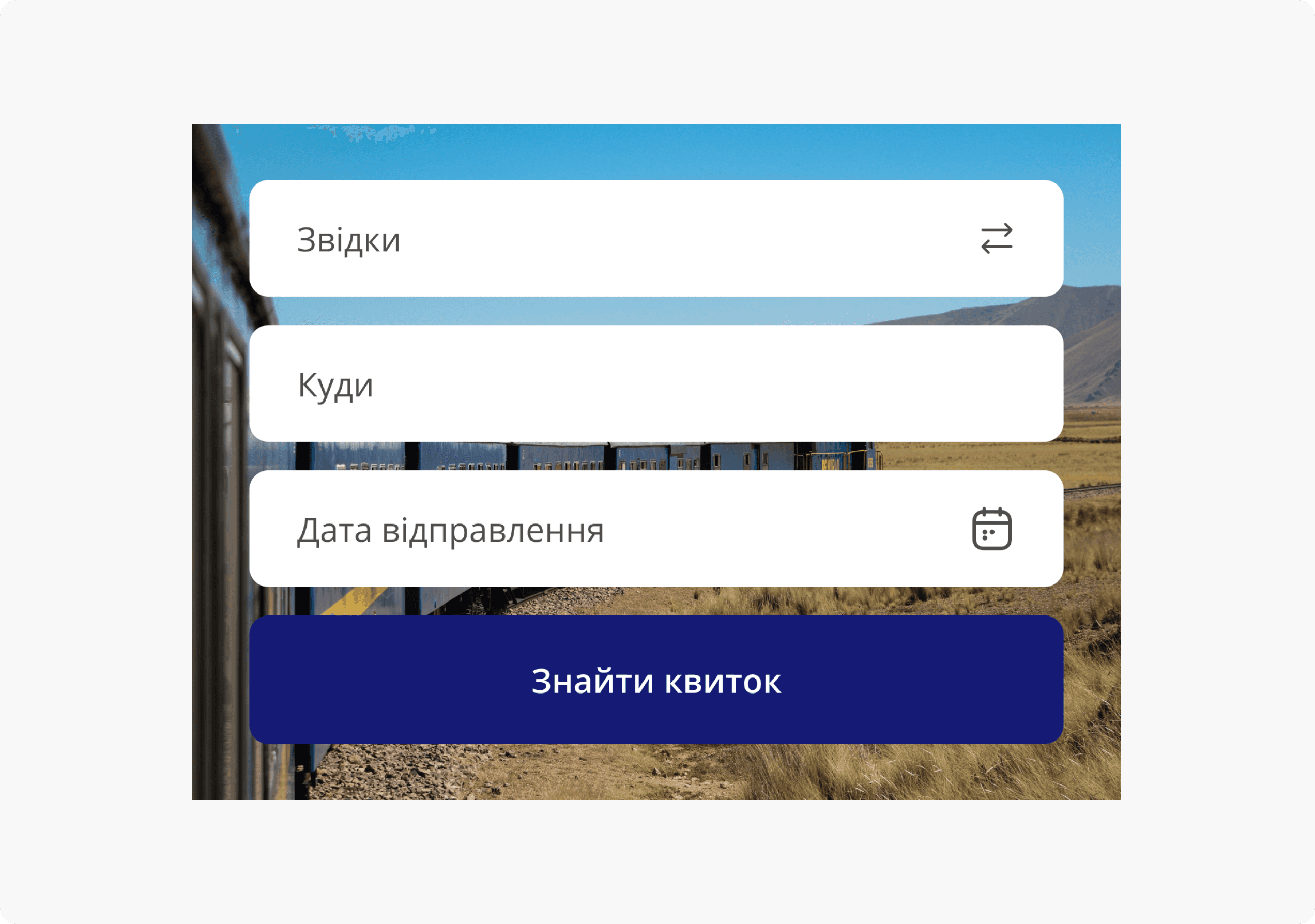
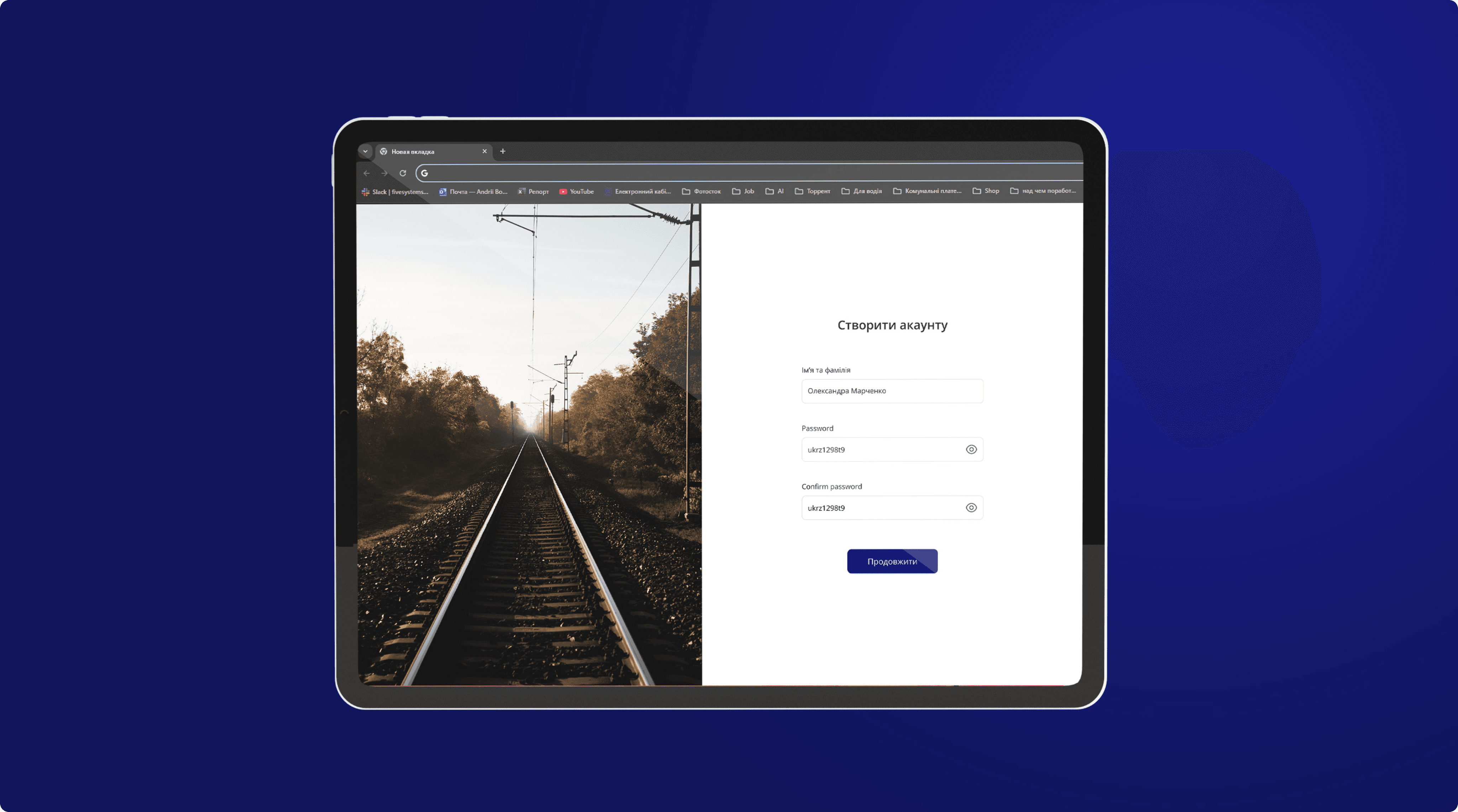
The website’s UX simplifies ticket purchases and service additions with intuitive navigation and minimal steps. It ensures users can quickly find what they need, with real-time updates enhancing the overall experience for first-time visitors and returning users alike.
The clean, minimal interface uses clear calls to action and intuitive forms.
The design focuses on simplicity, with balanced white space and modern typography, making the site visually appealing and easy to use.


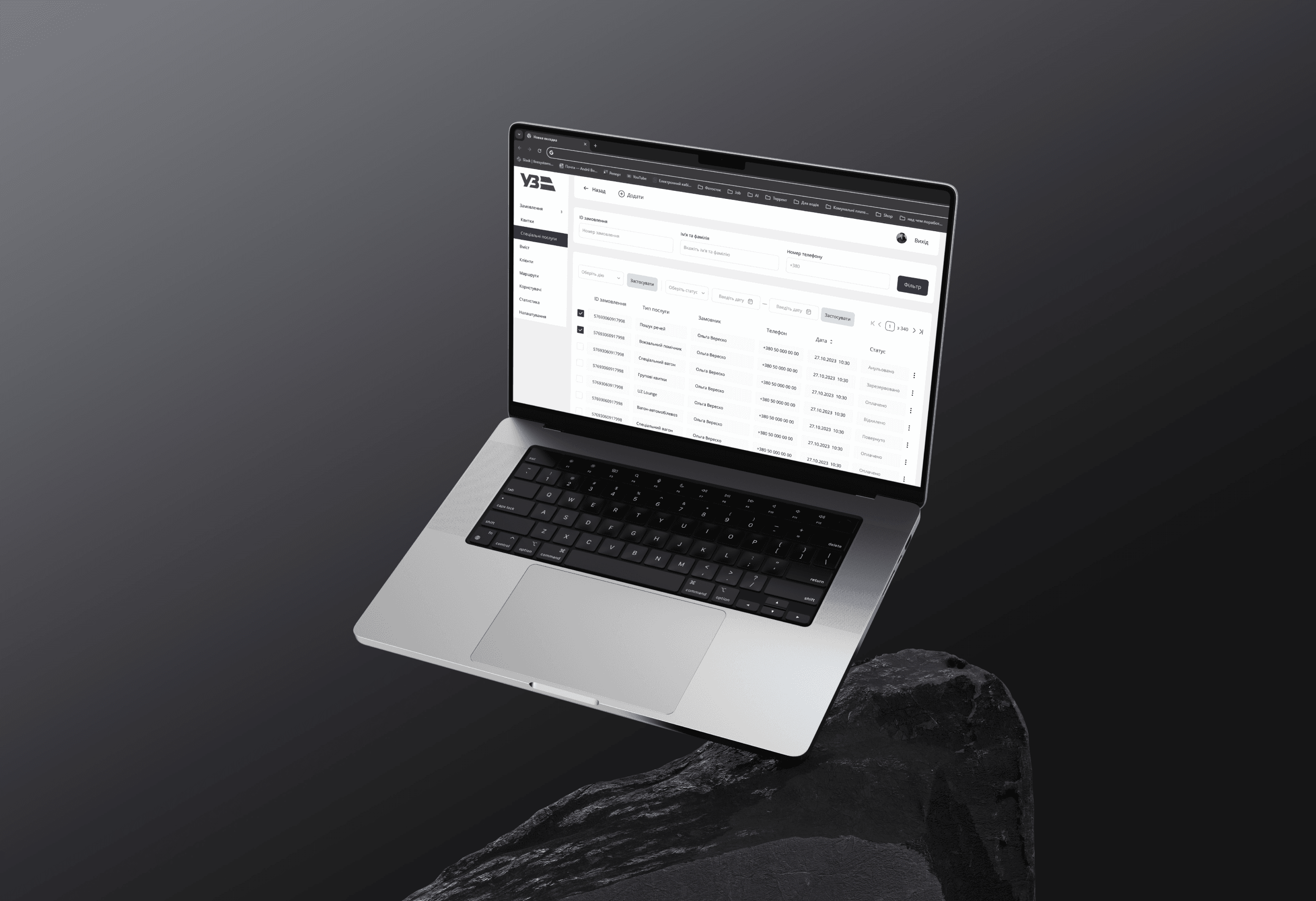
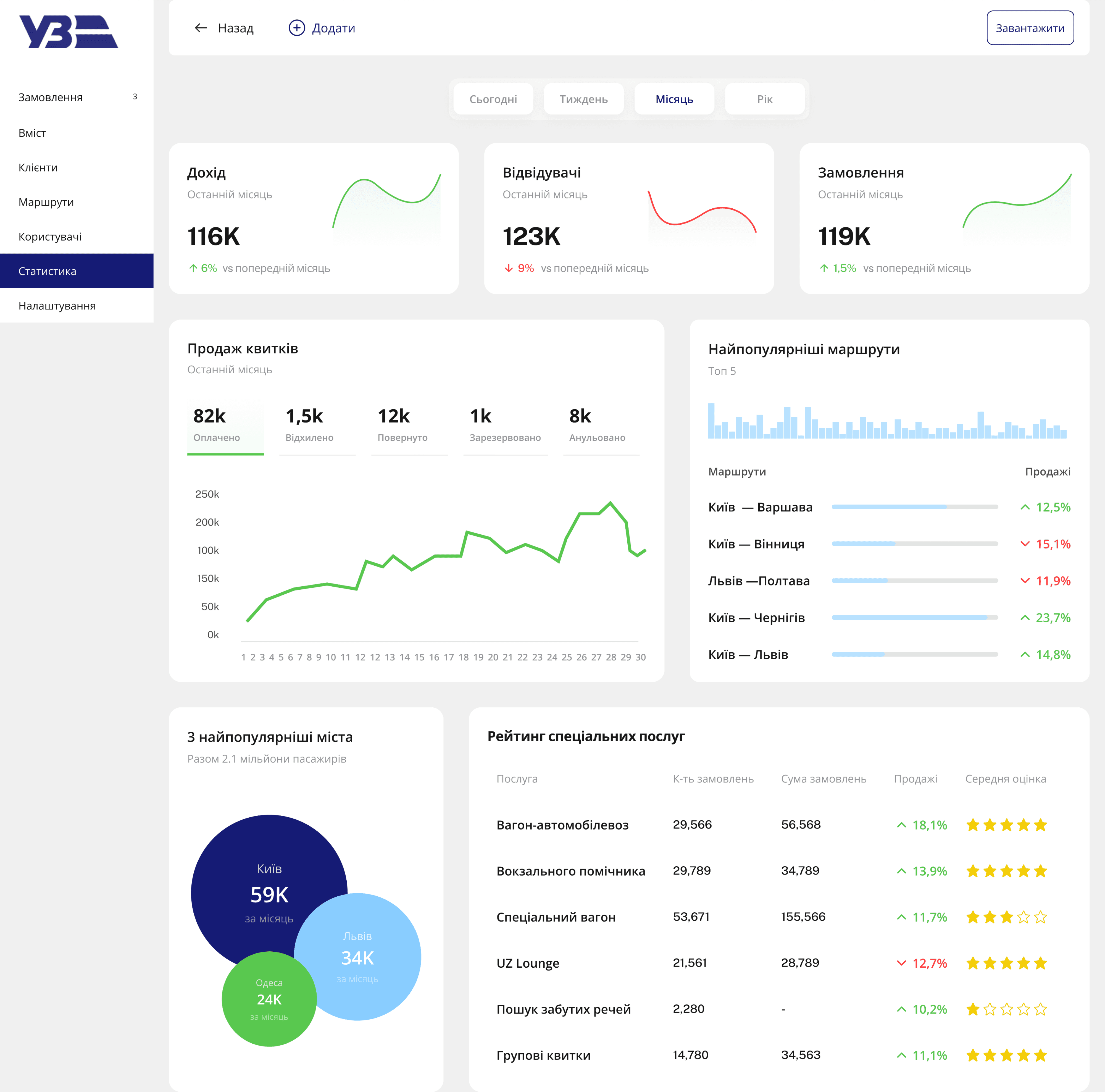
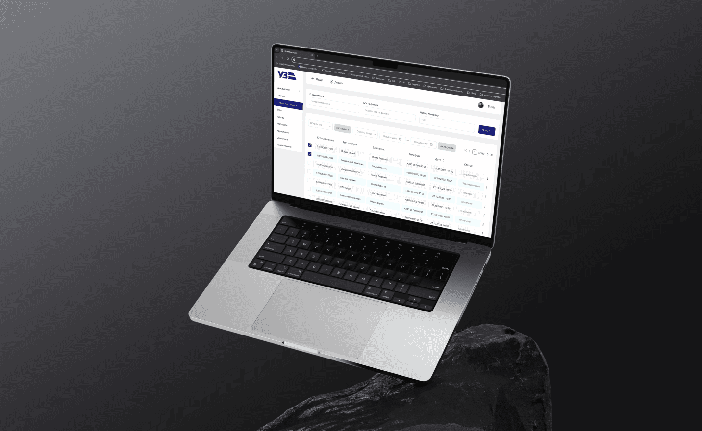
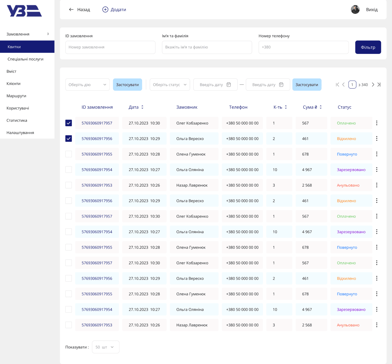
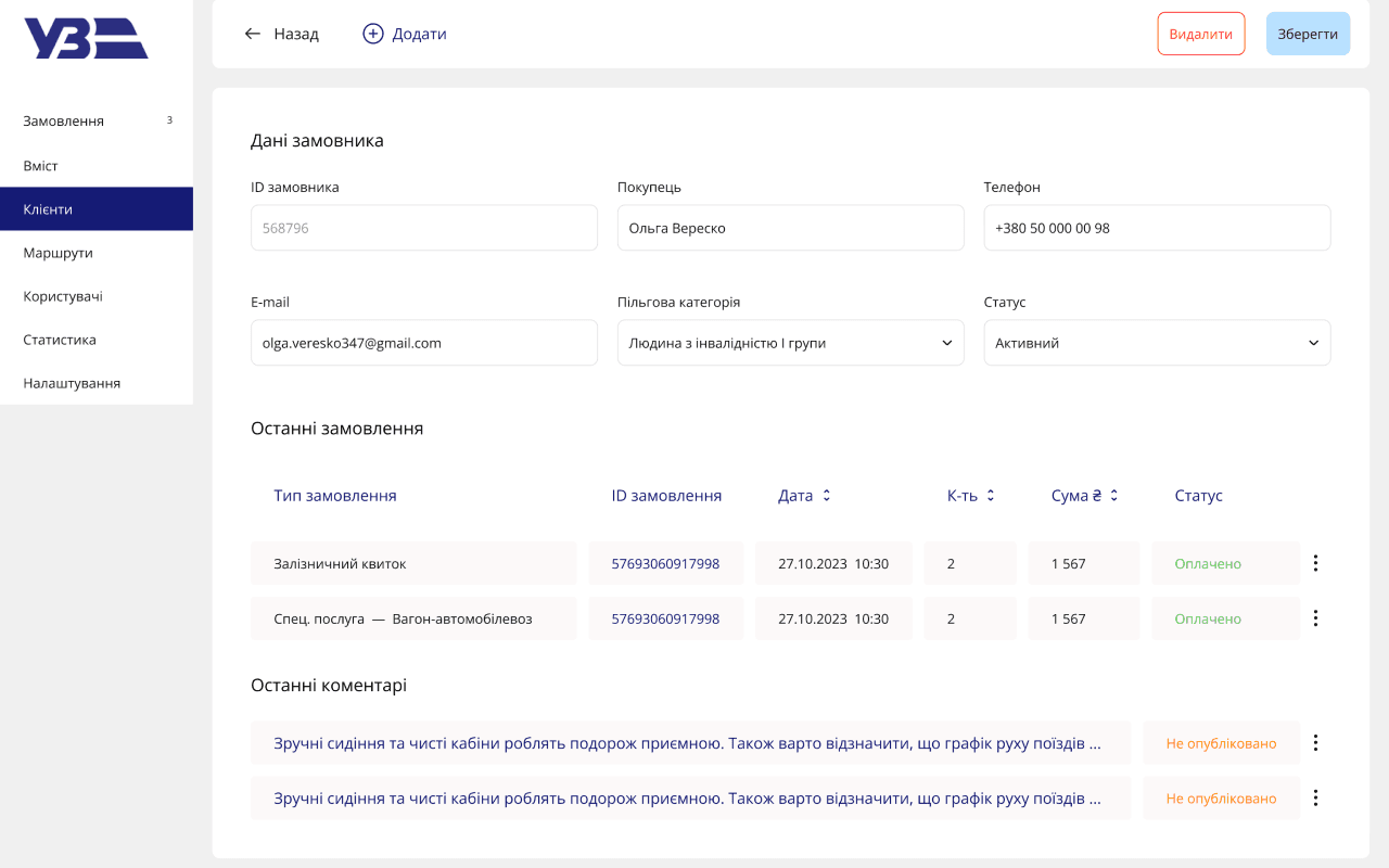
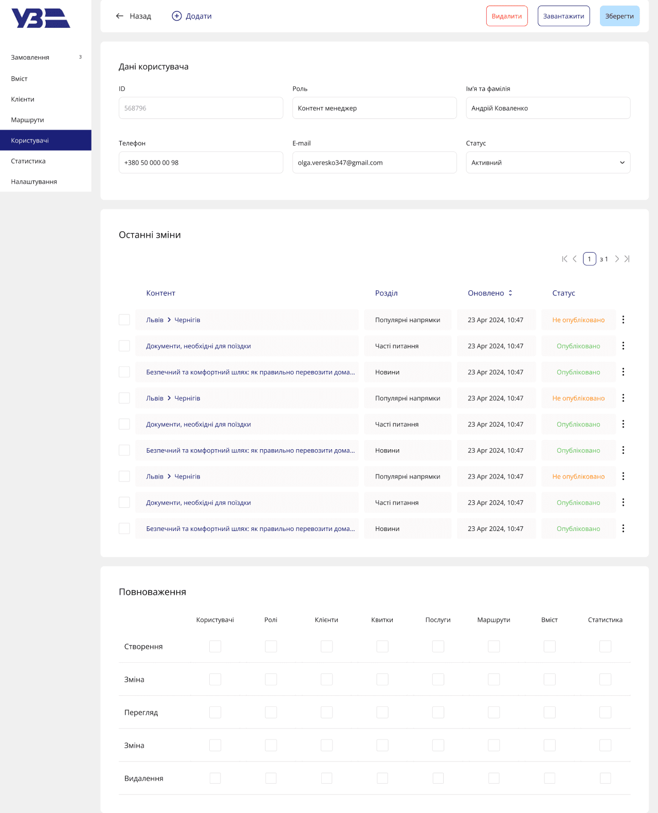
Admin Panel
The admin panel is optimized for efficiency, with a focus on easy data access and streamlined navigation. Filters and search functions allow users to quickly find relevant orders and services, while comprehensive stats and reports provide clear oversight. The roles structure ensures each user has access only to the tools they need, reducing complexity and improving workflow.
The interface is minimal and functional, prioritizing clarity and ease of use.
It’s organized with logical layouts and straightforward visuals, ensuring administrators can navigate seamlessly. The design keeps distractions to a minimum, focusing on a clean and intuitive experience for users performing daily tasks.


Result
The complete redesign improved the overall user experience for both end users and administrators, significantly enhancing the ticket purchasing process and the management of services. The platform now provides a more efficient, accessible, and visually appealing experience, with a modern and scalable design that aligns with Ukrzaliznytsia's needs.

Releted Projects
{ view all projects }


Looking for a new talent?
Let’s talk!
natalia.ux.ui.design@gmail.com
@2024 Natalia K.
available for a full - time position
Made by Natalia K.


I redesigned the Ukrzaliznytsia website and admin panel to enhance user experience and streamline operations. The website simplifies ticket searches and purchases, while offering personalized options like group bookings, special wagons, and lost-and-found services. Real-time timetables, news, and service catalogs are seamlessly integrated for a smooth user journey.
The admin panel provides efficient tools for managing orders, client data, services, and site content. With distinct roles for administrators, content managers, and support staff, the system ensures streamlined operations and improved service delivery.
landing page
admin panel
case stuDY
Branding
User Research Survey
User flow
competitor analysis
ux design
UI DESIGN
aDAPTATION
OCT 23
/ FEB 24
Branding
The redesign's branding reflects modernity, clarity, and accessibility. The design emphasizes readability, with a clear color palette and accessible typography that ensures inclusivity for users with varying visual abilities. Every detail, from button sizes to color contrast, was crafted to enhance user interaction while maintaining the company’s recognizable identity.
Website
The website’s UX simplifies ticket purchases and service additions with intuitive navigation and minimal steps. It ensures users can quickly find what they need, with real-time updates enhancing the overall experience for first-time visitors and returning users alike.
The clean, minimal interface uses clear calls to action and intuitive forms. The design focuses on simplicity, with balanced white space and modern typography, making the site visually appealing and easy to use.

Admin Panel
The admin panel is optimized for efficiency, with a focus on easy data access and streamlined navigation. Filters and search functions allow users to quickly find relevant orders and services, while comprehensive stats and reports provide clear oversight. The roles structure ensures each user has access only to the tools they need, reducing complexity and improving workflow.
The interface is minimal and functional, prioritizing clarity and ease of use. It’s organized with logical layouts and straightforward visuals, ensuring administrators can navigate seamlessly. The design keeps distractions to a minimum, focusing on a clean and intuitive experience for users performing daily tasks.


Result
The complete redesign improved the overall user experience for both end users and administrators, significantly enhancing the ticket purchasing process and the management of services. The platform now provides a more efficient, accessible, and visually appealing experience, with a modern and scalable design that aligns with Ukrzaliznytsia's needs.
Releted Projects
{ view all projects }
Looking for a new talent?
Let’s talk!
@2024 Natalia K. | natalia.ux.ui.design@gmail.com
RAILWAY
REDESIGN


I redesigned the Ukrzaliznytsia website and admin panel to enhance user experience and streamline operations. The website simplifies ticket searches and purchases, while offering personalized options like group bookings, special wagons, and lost-and-found services. Real-time timetables, news, and service catalogs are seamlessly integrated for a smooth user journey.
The admin panel provides efficient tools for managing orders, client data, services, and site content. With distinct roles for administrators, content managers, and support staff, the system ensures streamlined operations and improved service delivery.
Landing page
admin panel
case study
Branding
User Research Survey
User flow
competitor analysis
ux design
UI DESIGN
aDAPTATION
OCT 23
/ FEB 24
Branding
The redesign's branding reflects modernity, clarity, and accessibility. The design emphasizes readability, with a clear color palette and accessible typography that ensures inclusivity for users with varying visual abilities. Every detail, from button sizes to color contrast, was crafted to enhance user interaction while maintaining the company’s recognizable identity.

Website
The website’s UX simplifies ticket purchases and service additions with intuitive navigation and minimal steps. It ensures users can quickly find what they need, with real-time updates enhancing the overall experience for first-time visitors and returning users alike.
The clean, minimal interface uses clear calls to action and intuitive forms. The design focuses on simplicity, with balanced white space and modern typography, making the site visually appealing and easy to use.
Admin Panel
The admin panel is optimized for efficiency, with a focus on easy data access and streamlined navigation. Filters and search functions allow users to quickly find relevant orders and services, while comprehensive stats and reports provide clear oversight. The roles structure ensures each user has access only to the tools they need, reducing complexity and improving workflow.
The interface is minimal and functional, prioritizing clarity and ease of use. It’s organized with logical layouts and straightforward visuals, ensuring administrators can navigate seamlessly. The design keeps distractions to a minimum, focusing on a clean and intuitive experience for users performing daily tasks.


Result
The complete redesign improved the overall user experience for both end users and administrators, significantly enhancing the ticket purchasing process and the management of services. The platform now provides a more efficient, accessible, and visually appealing experience, with a modern and scalable design that aligns with Ukrzaliznytsia's needs.
Looking for a new talent?
Let’s talk!
@2024 Natalia K. | natalia.ux.ui.design@gmail.com
railway
redesign
I redesigned the Ukrzaliznytsia website and admin panel to enhance user experience and streamline operations. The website simplifies ticket searches and purchases, while offering personalized options like group bookings, special wagons, and lost-and-found services. Real-time timetables, news, and service catalogs are seamlessly integrated for a smooth user journey.
The admin panel provides efficient tools for managing orders, client data, services, and site content. With distinct roles for administrators, content managers, and support staff, the system ensures streamlined operations and improved service delivery.
Landing page
admin panel
case study
Branding
User Research Survey
User flow
competitor analysis
ux design
UI DESIGN
aDAPTATION
oct 23
/ feb 23
Branding
The redesign's branding reflects modernity, clarity, and accessibility. The design emphasizes readability, with a clear color palette and accessible typography that ensures inclusivity for users with varying visual abilities. Every detail, from button sizes to color contrast, was crafted to enhance user interaction while maintaining the company’s recognizable identity.

Website
The website’s UX simplifies ticket purchases and service additions with intuitive navigation and minimal steps. It ensures users can quickly find what they need, with real-time updates enhancing the overall experience for first-time visitors and returning users alike.
The clean, minimal interface uses clear calls to action and intuitive forms. The design focuses on simplicity, with balanced white space and modern typography, making the site visually appealing and easy to use.
Admin Panel
The admin panel is optimized for efficiency, with a focus on easy data access and streamlined navigation. Filters and search functions allow users to quickly find relevant orders and services, while comprehensive stats and reports provide clear oversight. The roles structure ensures each user has access only to the tools they need, reducing complexity and improving workflow.
The interface is minimal and functional, prioritizing clarity and ease of use. It’s organized with logical layouts and straightforward visuals, ensuring administrators can navigate seamlessly. The design keeps distractions to a minimum, focusing on a clean and intuitive experience for users performing daily tasks.

Result
The complete redesign improved the overall user experience for both end users and administrators, significantly enhancing the ticket purchasing process and the management of services. The platform now provides a more efficient, accessible, and visually appealing experience, with a modern and scalable design that aligns with Ukrzaliznytsia's needs.

Looking for a new talent?
Let’s talk!
natalia.ux.ui.design@gmail.com
@2024 Natalia K.