
The Constructa Studio website redesign showcases a minimalist aesthetic that perfectly aligns with the architectural studio’s focus on precision and innovation. The streamlined interface not only highlights the studio's impressive portfolio but also enhances the user experience by making project exploration seamless.
Each section was carefully crafted to reflect the studio's modern and eco-conscious approach to architecture, from detailed project showcases to sustainable design philosophies. The result is a visually striking, user-friendly platform that mirrors the studio's creative vision and elevates its digital presence.
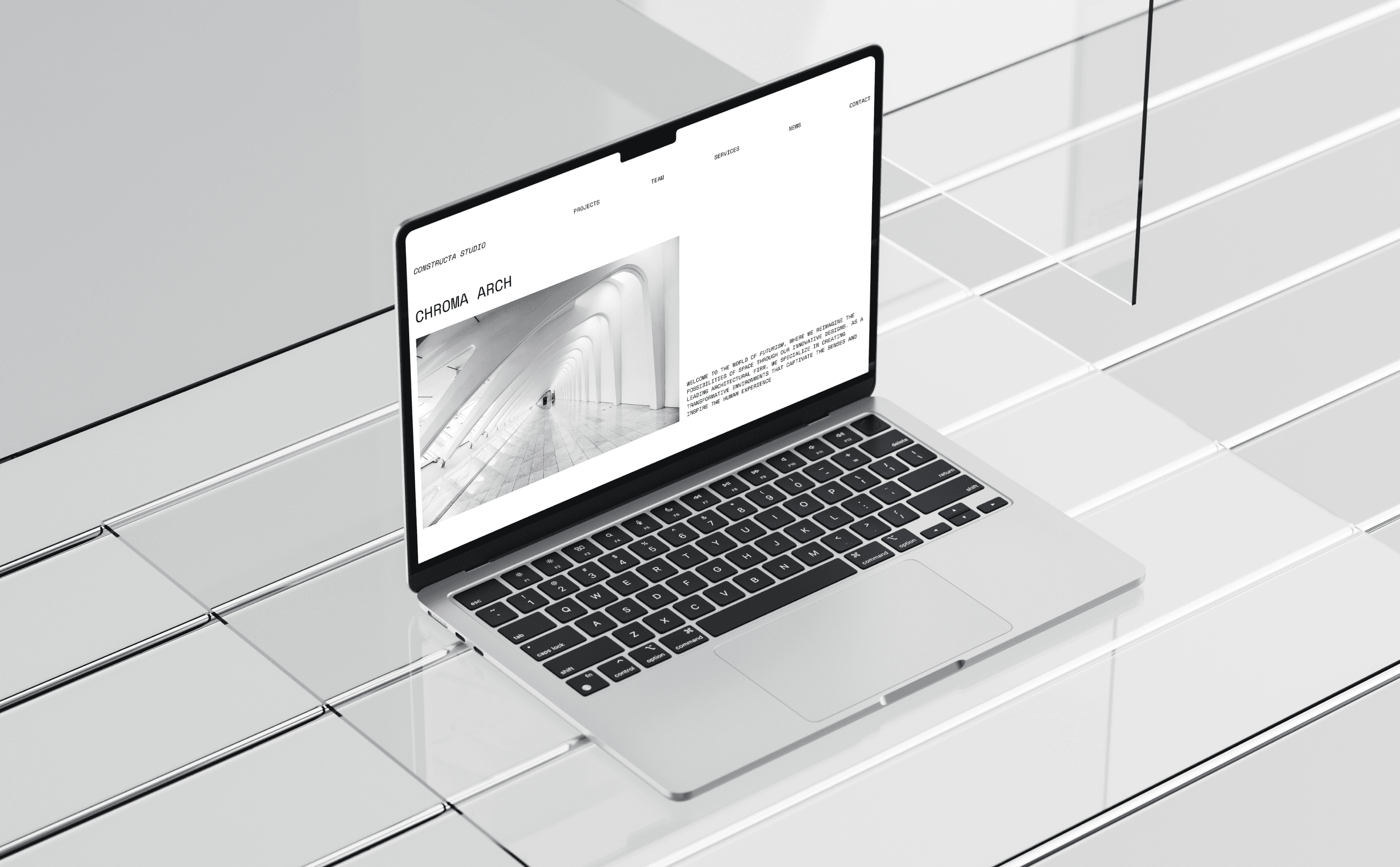
landing page
Case study
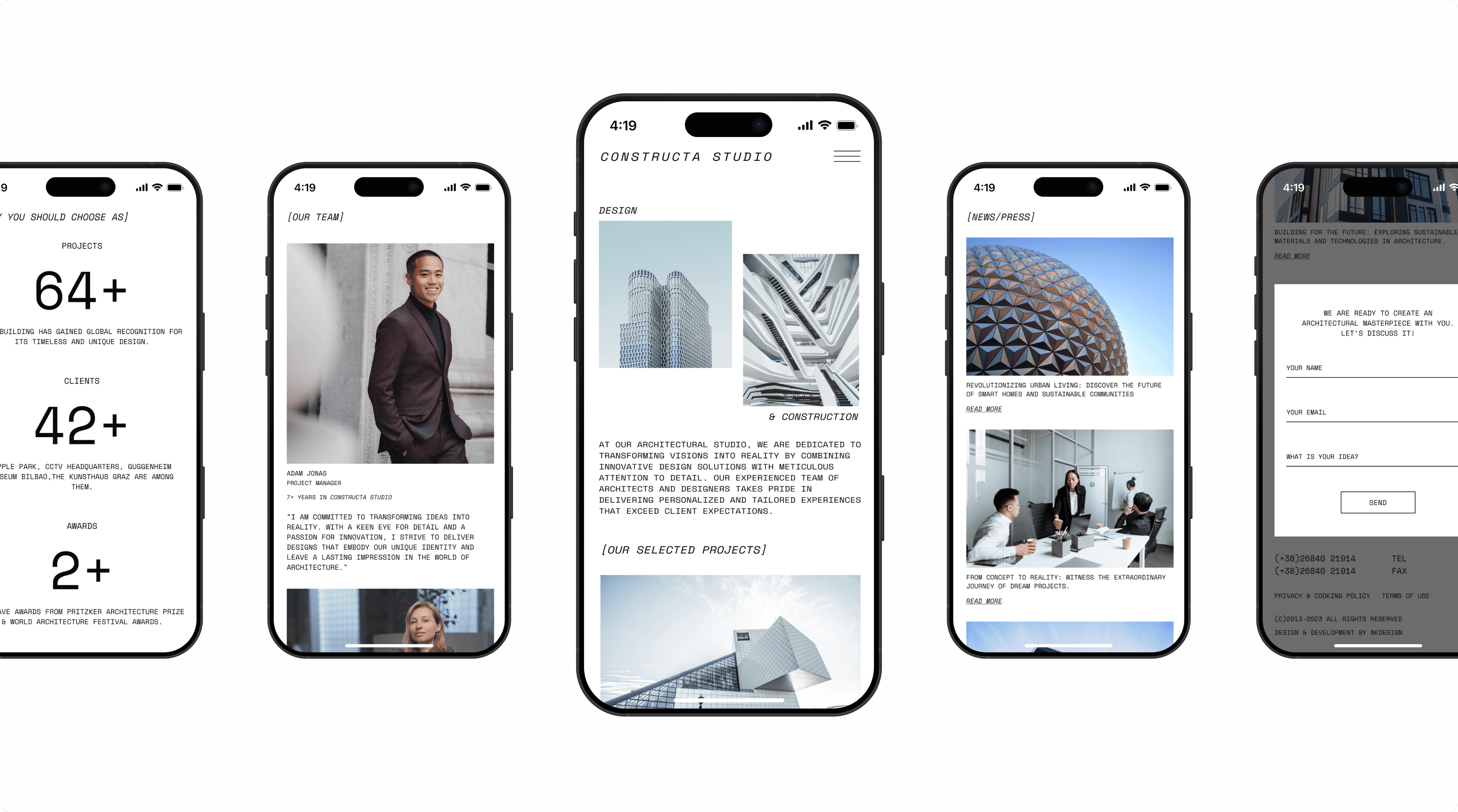
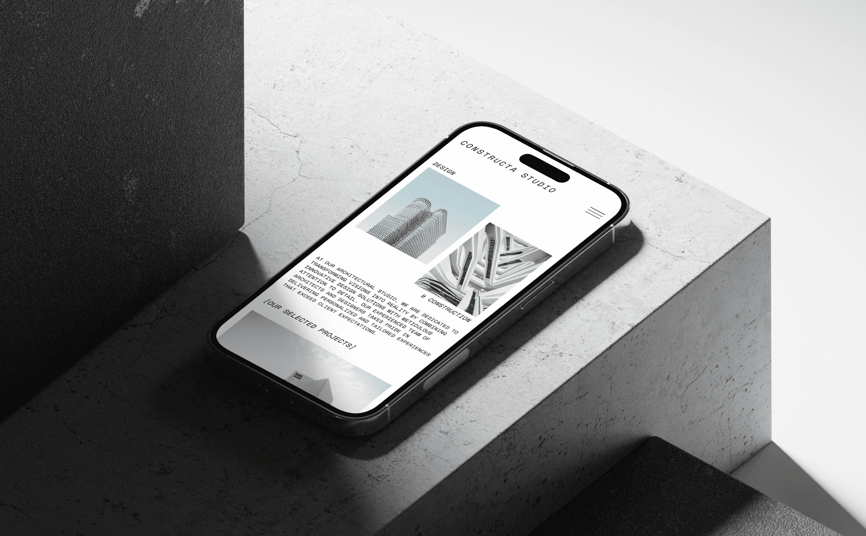
mobile
branding
Branding
User Research Survey
User flow
competitor analysis
ux design
UI DESIGN
aDAPTATION
july 23
/ june 23
Branding
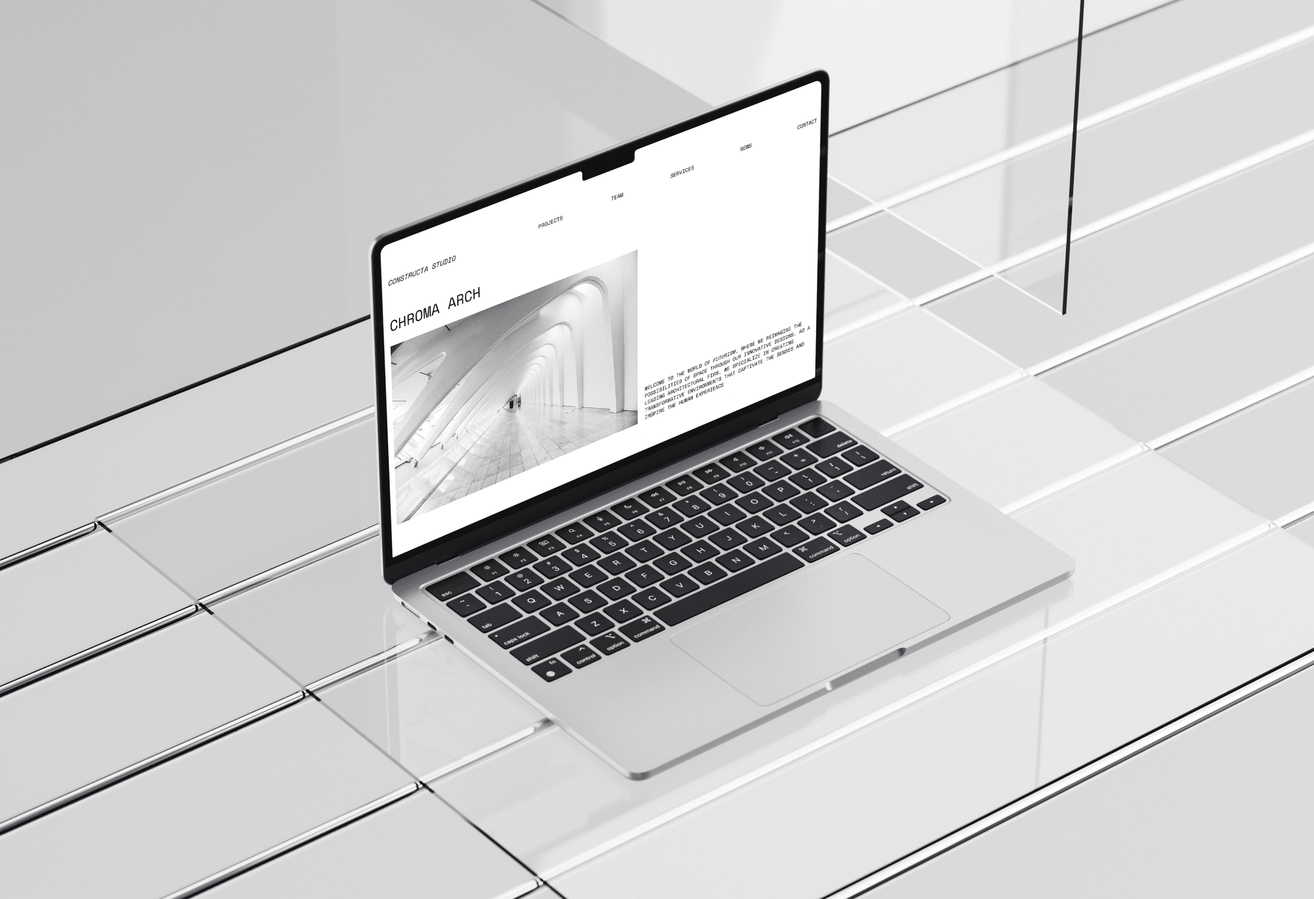
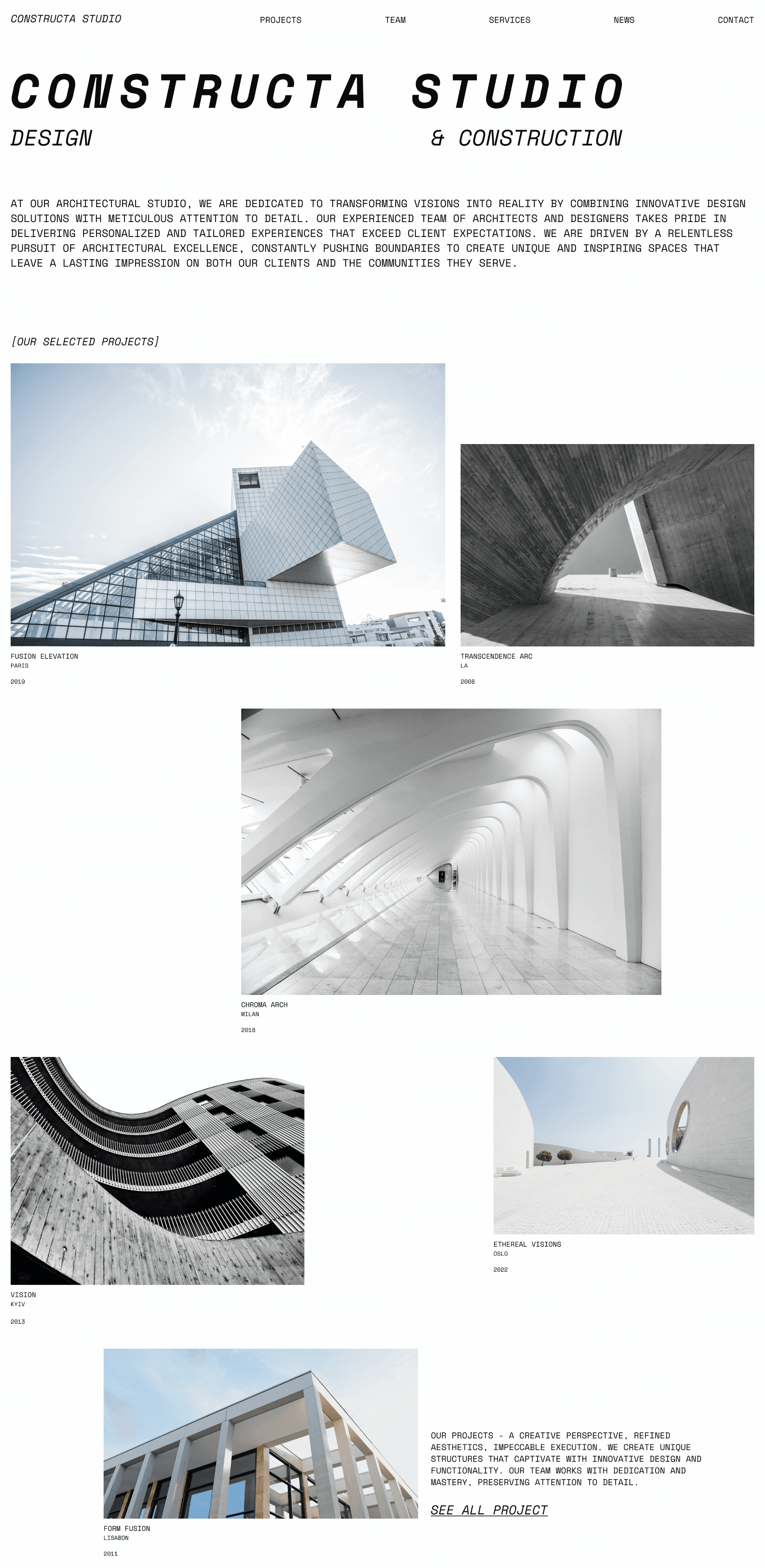
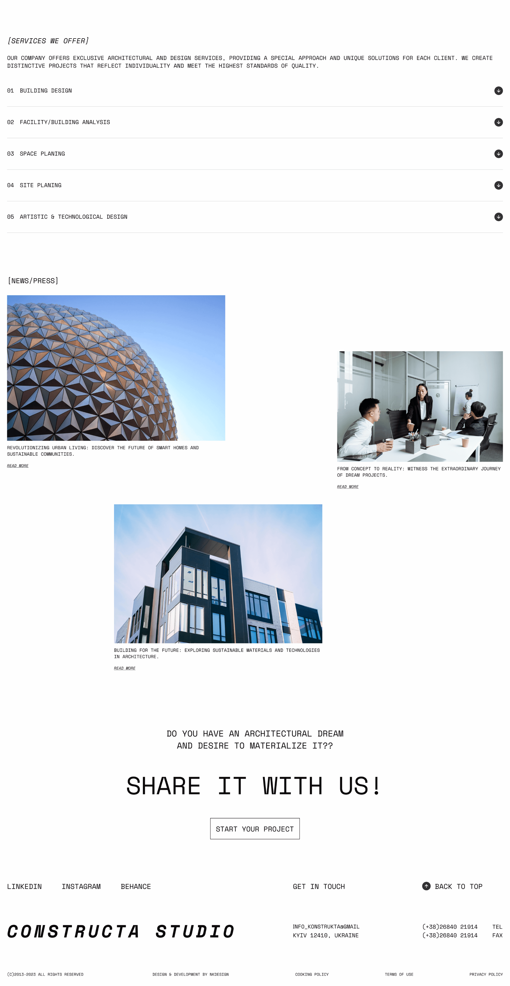
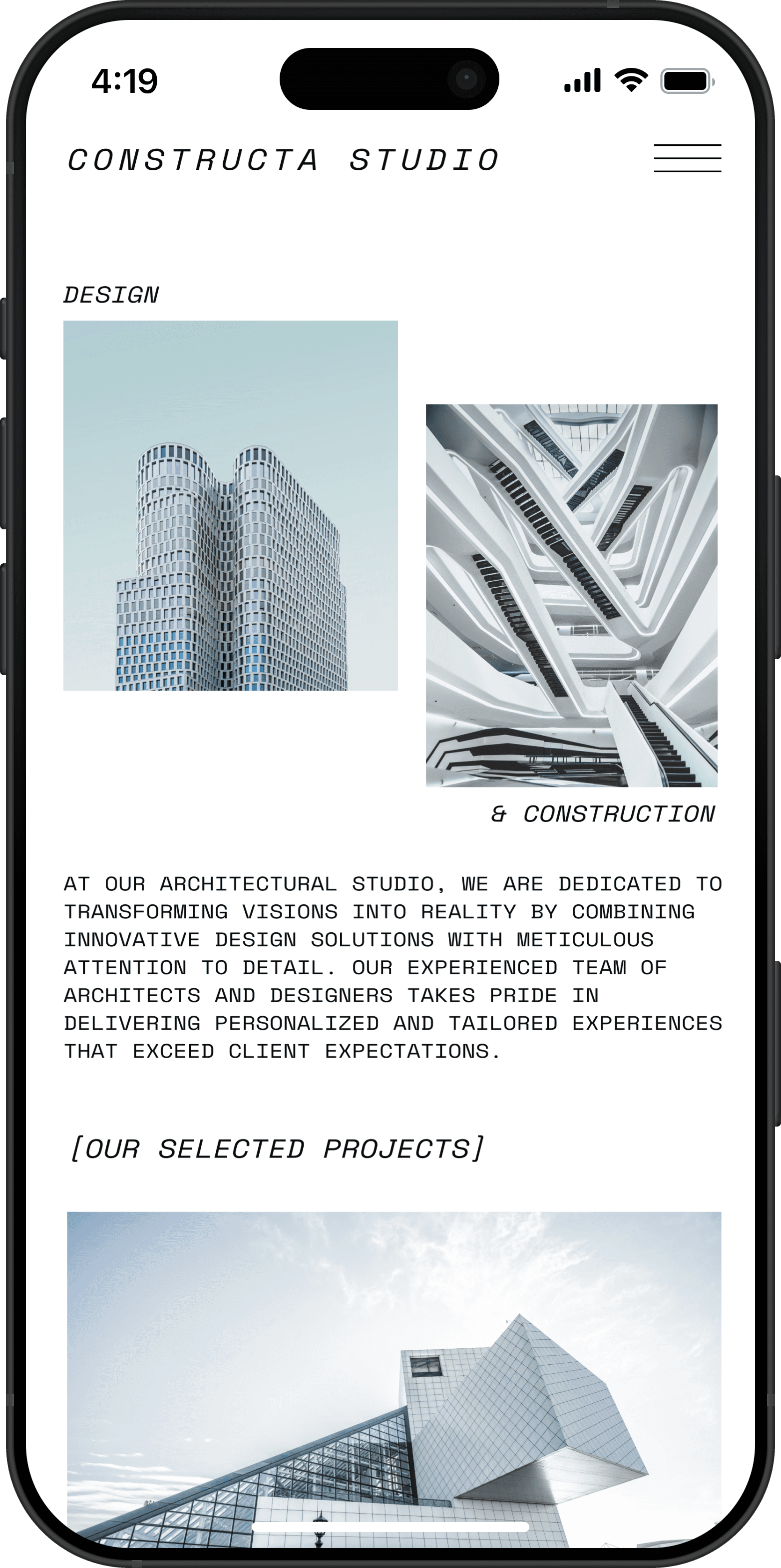
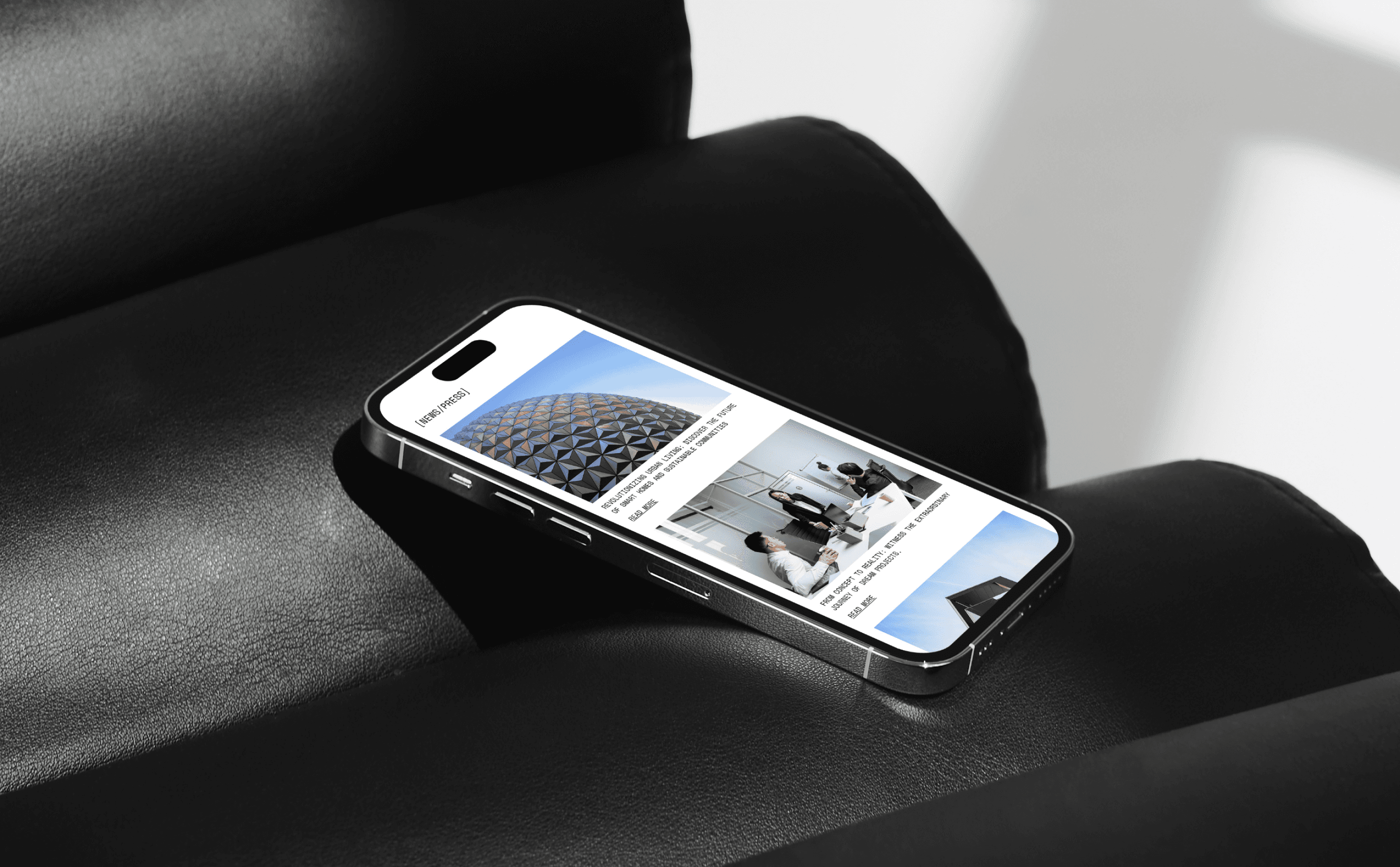
The website’s branding reflects the architectural studio’s modern aesthetic with a minimalist white background that highlights the precision of each project. Clean typography and subtle accents complement the visuals, drawing attention to the studio’s innovative designs. Accompanying text reinforces the studio’s commitment to delivering tailored, high-quality solutions that exceed client expectations.


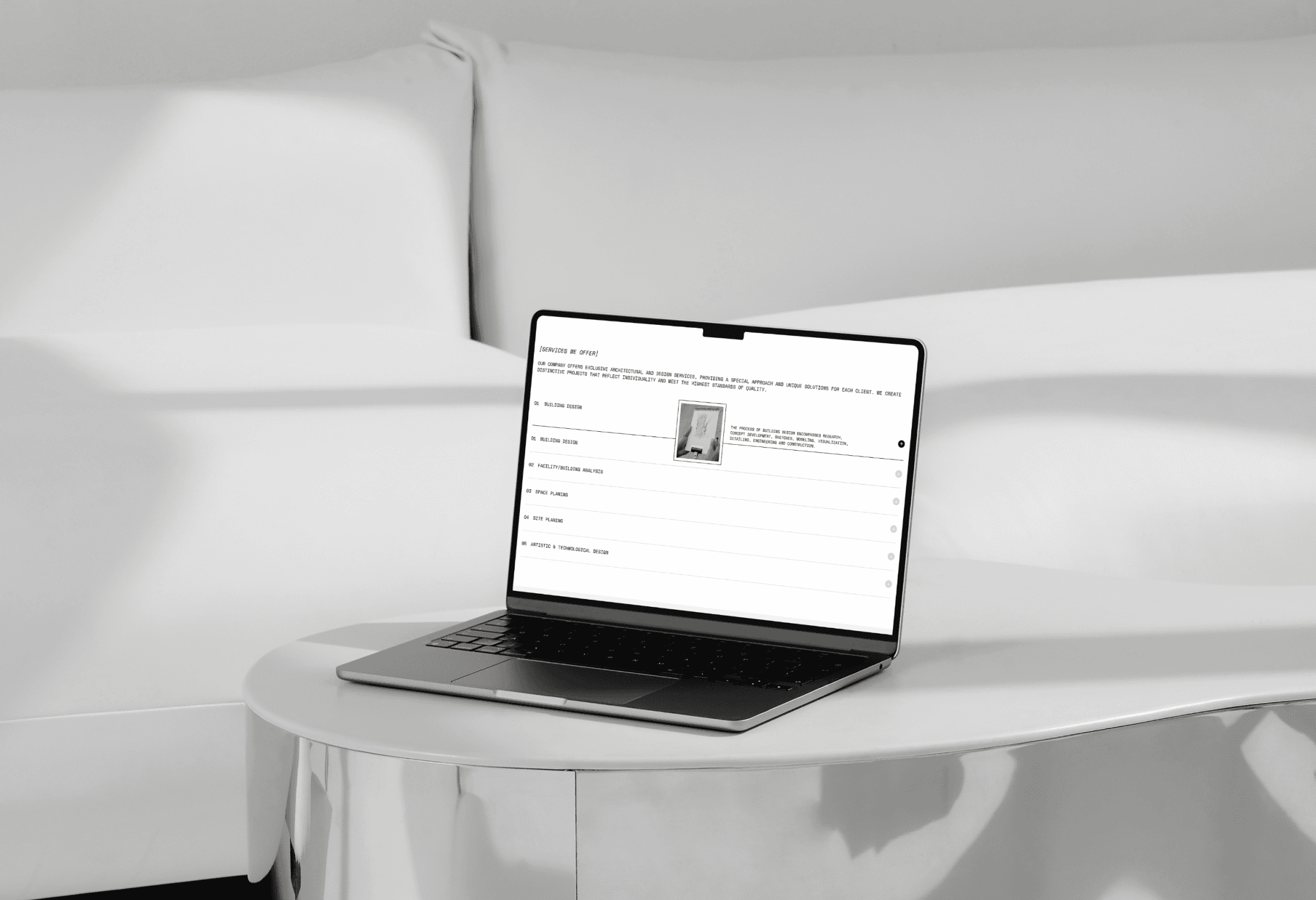
UX/UI Design
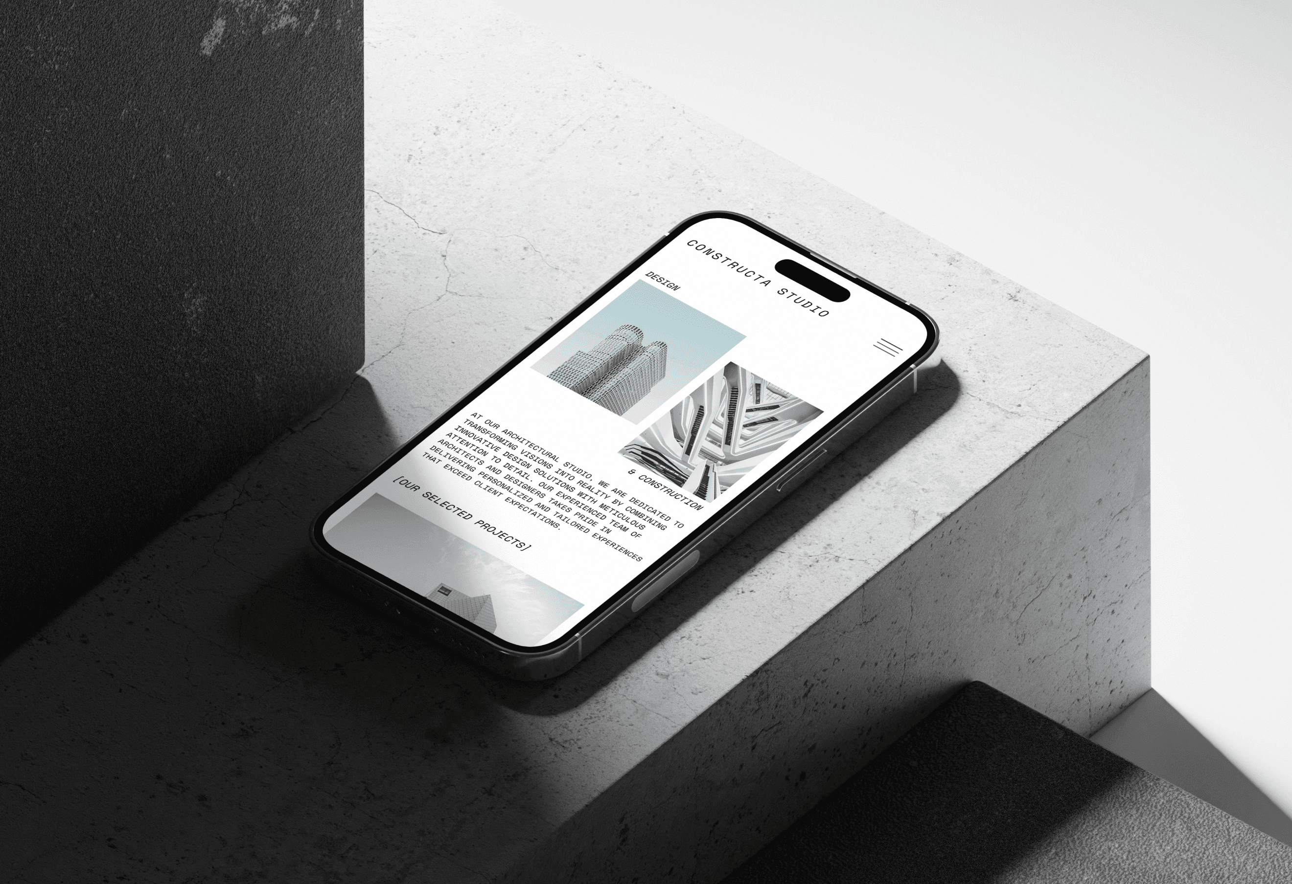
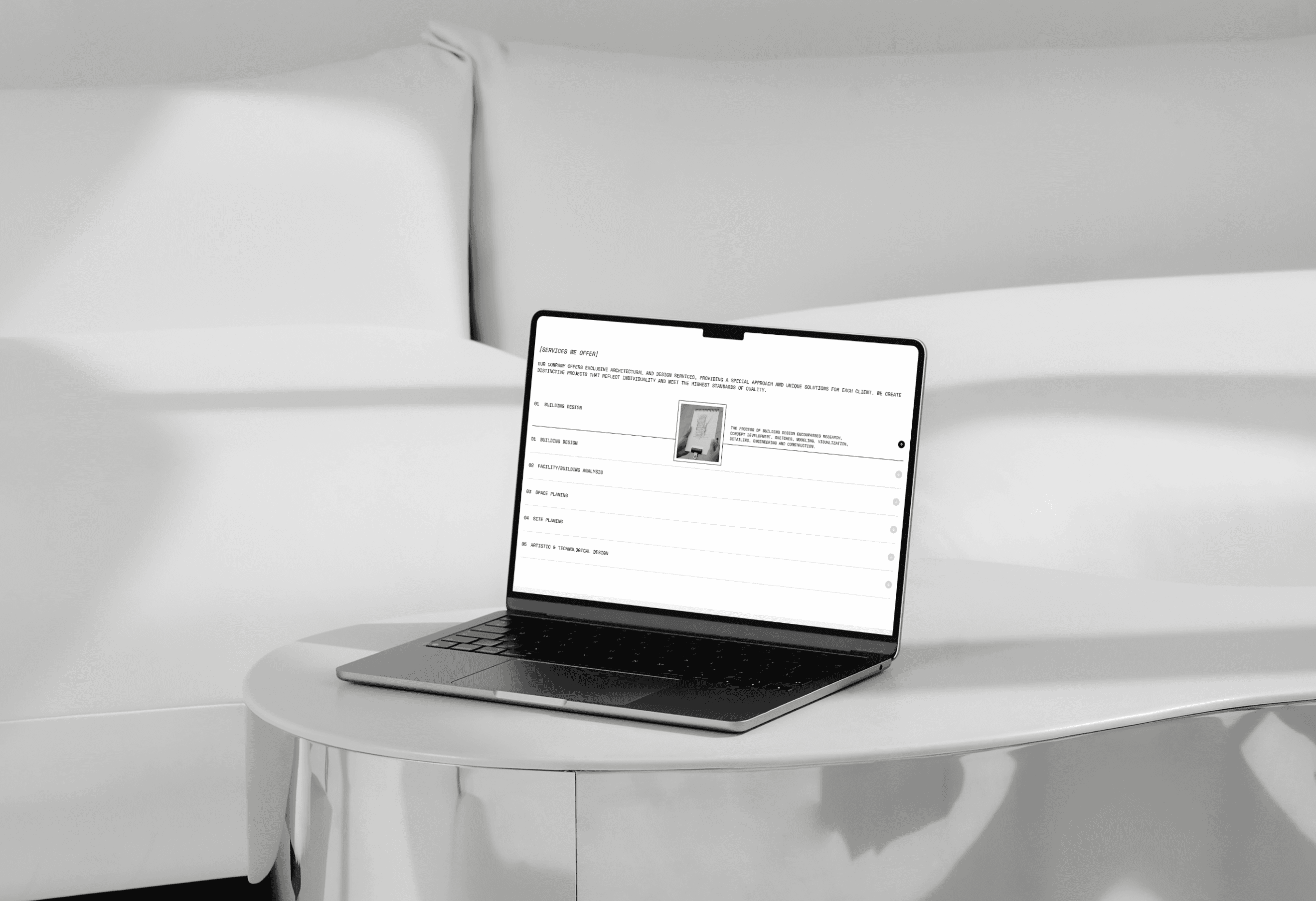
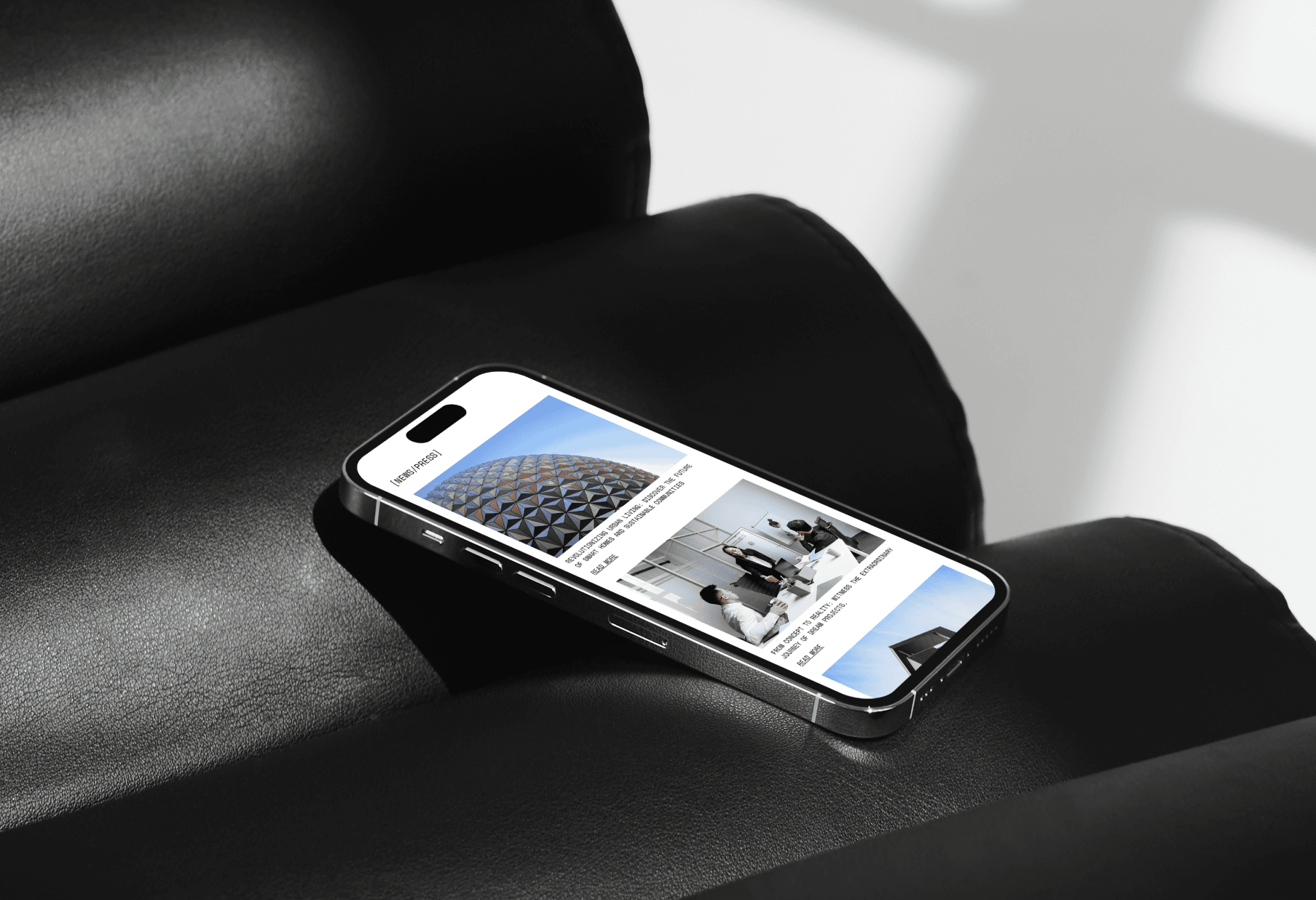
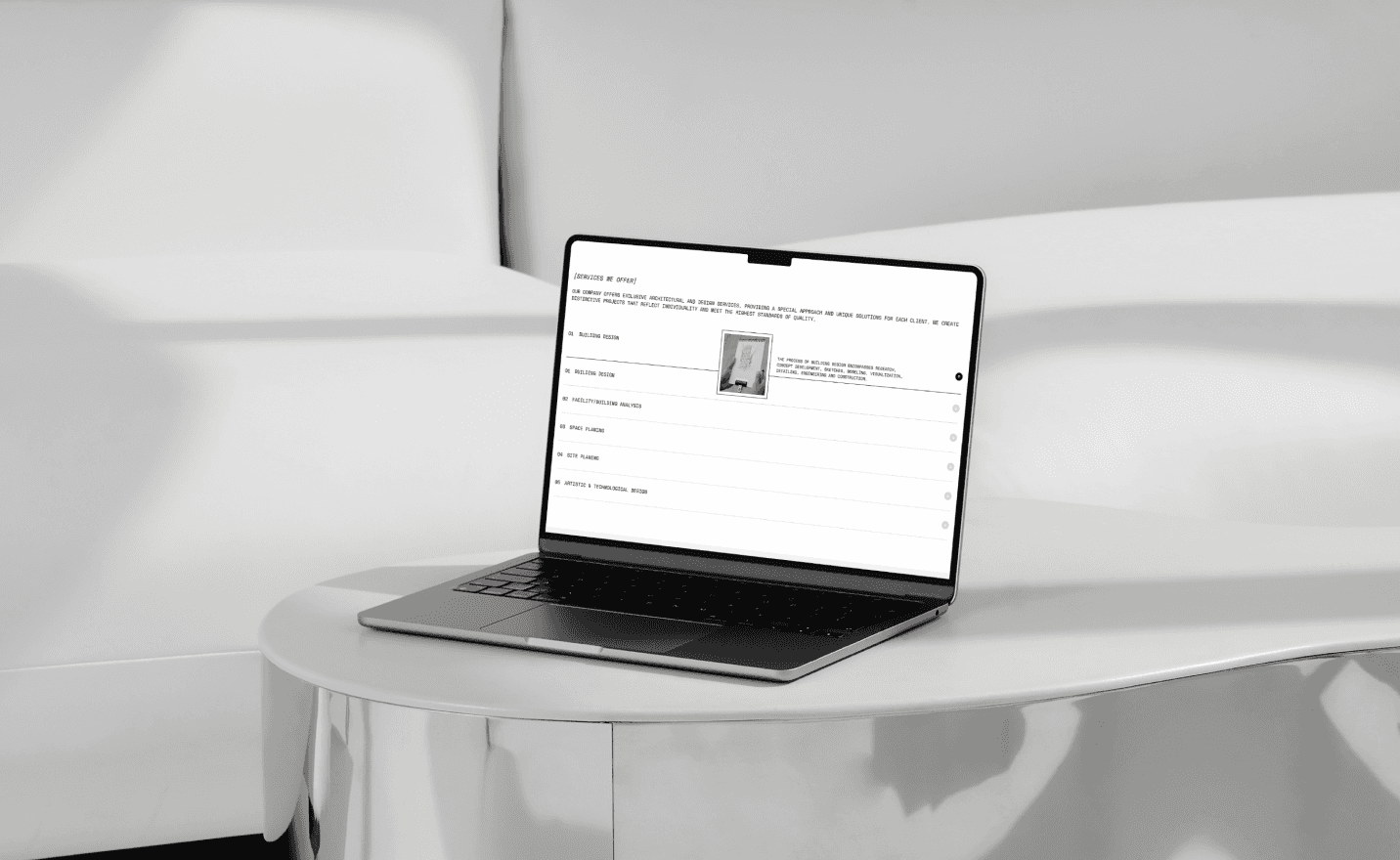
The UX design ensures smooth navigation and a user-friendly experience, emphasizing simplicity and quick access to project details. Clear labels, minimalistic layouts, and responsive design enhance usability, offering a seamless experience across devices.
The UI captures the studio’s modern aesthetic with a refined color palette, sleek typography, and minimal design elements. Interactive components are subtle yet effective, guiding users while maintaining a clean, visually appealing interface that mirrors the studio’s architectural elegance.

Result
The minimalist design effectively highlights the studio’s projects, enhancing user interaction and engagement. The seamless navigation and thoughtful presentation of content create an immersive experience that aligns with the studio's values, leading to stronger connections with visitors and a lasting impression of the studio's work.


Releted Projects
{ view all projects }


Looking for a new talent?
Let’s talk!
natalia.ux.ui.design@gmail.com
@2024 Natalia K.
available for a full - time position
Made by Natalia K.


The Constructa Studio website redesign showcases a minimalist aesthetic that perfectly aligns with the architectural studio’s focus on precision and innovation. The streamlined interface not only highlights the studio's impressive portfolio but also enhances the user experience by making project exploration seamless.
Each section was carefully crafted to reflect the studio's modern and eco-conscious approach to architecture, from detailed project showcases to sustainable design philosophies. The result is a visually striking, user-friendly platform that mirrors the studio's creative vision and elevates its digital presence..
landing page
case study
mobile
branding
Branding
User Research Survey
User flow
competitor analysis
ux design
UI DESIGN
aDAPTATION
july 23
/ june 23
Branding
The website’s branding reflects the architectural studio’s modern aesthetic with a minimalist white background that highlights the precision of each project. Clean typography and subtle accents complement the visuals, drawing attention to the studio’s innovative designs. Accompanying text reinforces the studio’s commitment to delivering tailored, high-quality solutions that exceed client expectations.


UX/UI Design
The UX design ensures smooth navigation and a user-friendly experience, emphasizing simplicity and quick access to project details. Clear labels, minimalistic layouts, and responsive design enhance usability, offering a seamless experience across devices.
The UI captures the studio’s modern aesthetic with a refined color palette, sleek typography, and minimal design elements. Interactive components are subtle yet effective, guiding users while maintaining a clean, visually appealing interface that mirrors the studio’s architectural elegance.
Result
The minimalist design effectively highlights the studio’s projects, enhancing user interaction and engagement. The seamless navigation and thoughtful presentation of content create an immersive experience that aligns with the studio's values, leading to stronger connections with visitors and a lasting impression of the studio's work.
Releted Projects
{ view all projects }
Looking for a new talent?
Let’s talk!
@2024 Natalia K. | natalia.ux.ui.design@gmail.com
constructa studio

The Constructa Studio website redesign showcases a minimalist aesthetic that perfectly aligns with the architectural studio’s focus on precision and innovation. The streamlined interface not only highlights the studio's impressive portfolio but also enhances the user experience by making project exploration seamless.
Each section was carefully crafted to reflect the studio's modern and eco-conscious approach to architecture, from detailed project showcases to sustainable design philosophies. The result is a visually striking, user-friendly platform that mirrors the studio's creative vision and elevates its digital presence.
Landing page
case study
mobile
BRANDING
Branding
User Research Survey
User flow
competitor analysis
ux design
UI DESIGN
aDAPTATION
july 23
/ june 23
Branding
The website’s branding reflects the architectural studio’s modern aesthetic with a minimalist white background that highlights the precision of each project. Clean typography and subtle accents complement the visuals, drawing attention to the studio’s innovative designs. Accompanying text reinforces the studio’s commitment to delivering tailored, high-quality solutions that exceed client expectations.

UX/UI Design
The UX design ensures smooth navigation and a user-friendly experience, emphasizing simplicity and quick access to project details. Clear labels, minimalistic layouts, and responsive design enhance usability, offering a seamless experience across devices.
The UI captures the studio’s modern aesthetic with a refined color palette, sleek typography, and minimal design elements. Interactive components are subtle yet effective, guiding users while maintaining a clean, visually appealing interface that mirrors the studio’s architectural elegance.
Result
The Creative Art Gallery website transforms the user experience with its sleek design, where vibrant accents and intuitive navigation create a seamless journey through curated collections. By simplifying ticket purchases and highlighting artworks, the platform enhances engagement, offering visitors a deeper connection to the gallery’s offerings.
Looking for a new talent?
Let’s talk!
@2024 Natalia K. | natalia.ux.ui.design@gmail.com
constructa studio


The Constructa Studio website redesign showcases a minimalist aesthetic that perfectly aligns with the architectural studio’s focus on precision and innovation. The streamlined interface not only highlights the studio's impressive portfolio but also enhances the user experience by making project exploration seamless.
Each section was carefully crafted to reflect the studio's modern and eco-conscious approach to architecture, from detailed project showcases to sustainable design philosophies. The result is a visually striking, user-friendly platform that mirrors the studio's creative vision and elevates its digital presence..
Landing page
case study
mobile
branding
Branding
User Research Survey
User flow
competitor analysis
ux design
UI DESIGN
aDAPTATION
july 23
/ june 23
Branding
The website’s branding reflects the architectural studio’s modern aesthetic with a minimalist white background that highlights the precision of each project. Clean typography and subtle accents complement the visuals, drawing attention to the studio’s innovative designs. Accompanying text reinforces the studio’s commitment to delivering tailored, high-quality solutions that exceed client expectations.


UX/UI Design
The UX design ensures smooth navigation and a user-friendly experience, emphasizing simplicity and quick access to project details. Clear labels, minimalistic layouts, and responsive design enhance usability, offering a seamless experience across devices.
The UI captures the studio’s modern aesthetic with a refined color palette, sleek typography, and minimal design elements. Interactive components are subtle yet effective, guiding users while maintaining a clean, visually appealing interface that mirrors the studio’s architectural elegance.
Result
The Creative Art Gallery website transforms the user experience with its sleek design, where vibrant accents and intuitive navigation create a seamless journey through curated collections. By simplifying ticket purchases and highlighting artworks, the platform enhances engagement, offering visitors a deeper connection to the gallery’s offerings.

Looking for a new talent?
Let’s talk!
natalia.ux.ui.design@gmail.com
@2024 Natalia K.